DATA HANDLING - MATHEMATICAL LITERACY QUESTIONS AND ANSWERS GRADE 12
Share via Whatsapp Join our WhatsApp Group Join our Telegram GroupActivity 1: Working with frequency tables
The Geography examination marks, expressed as a percentage, of 52 learners were recorded as follows:
54 | 67 | 83 | 34 | 49 | 56 | 78 | 89 | 90 | 79 | 20 | 49 | 50 |
70 | 89 | 57 | 27 | 48 | 56 | 65 | 70 | 22 | 98 | 89 | 29 | 56 |
47 | 95 | 49 | 67 | 89 | 48 | 46 | 89 | 63 | 75 | 45 | 50 | 58 |
73 | 67 | 45 | 76 | 70 | 38 | 46 | 37 | 47 | 36 | 38 | 99 | 100 |
In the exam you are required to show results in terms of seven performance levels rather than percentages. As a result, the subject internal moderator who is analysing the results needs to work out the number of learners per performance level. Complete the frequency table below to work out the number of learners per performance level. [14]
FREQUENCY TABLE : LEARNER PERFORMANCE IN GEOGRAPHY | |||
PERFORMANCE LEVEL | PERCENTAGE RANGE | TALLY | FREQUENCY |
1 | 0 to 29 | ||
2 | 30 to 39 | ||
3 | 40 to 49 | ||
4 | 50 to 59 | ||
5 | 60 to 69 | ||
6 | 70 to 79 | ||
7 | 80 to 100 | ||
Solutions | |||
Frequency table : learner performance in geography | |||
Performance Level | Percentage Range | Tally | Frequency |
1 | 0 to 29 | III ✓ | 4 ✓ |
2 | 30 to 39 | IIII✓ | 5 ✓ |
3 | 40 to 49 | IIII IIII I ✓ | 11 ✓ |
4 | 50 to 59 | IIII III ✓ | 8 ✓ |
5 | 60 to 69 | IIII ✓ | 5 ✓ |
6 | 70 to 79 | IIII III ✓ | 8 ✓ |
7 | 80 to 100 | IIII IIII I ✓ | 11 ✓ |
[14] | |||
Activity 2: Measures of central tendency
1. Information for question 1
Thandeka has a shop with a scrapbooking department and a toy department. She kept a record of the ages of the customers who visited the two departments on a particular day.
Scrapbooking is a hobby which involves cutting and pasting photos, pictures and other decorative items into a book.
Ages of customers who visited the scrapbooking department
35 | 60 | 46 | 57 | 54 |
34 | 60 | 54 | 56 | 46 |
47 | 67 | 65 | 54 | 45 |
Ages of customers who visited the toy department
5 | 15 | 25 | 7 | 36 | 21 | 70 | |
20 | 17 | 6 | 15 | 65 | 9 | 15 | |
1. | a) | Arrange the ages of the customers who visited the toy department in ascending order. | (1) | ||||
b) | Determine the mode of the ages of customers who visited the scrapbooking department. | (1) | |||||
c) | Calculate the mean age of the customers who visited the scrapbooking department. | (3) | |||||
d) | Determine the median age of customers who visited the toy department. | (4) | |||||
e) | How many customers visited the toy department? | (1) | |||||
f) | Calculate the percentage of customers older than 50 years who visited the scrapbooking department. | (1) | |||||
2.) The table below shows the results of the games played by 16 teams who are playing against each other to win the league.
Absa Premiership
Pos | Team | Pld | W | D | L | GF | GA | Pts |
1 | Kaizer Chiefs | 19 | 13 | 4 | 2 | 31 | 12 | 43 |
2 | Mamelodi Sundowns | 19 | 10 | 4 | 5 | 33 | 21 | 34 |
3 | Bidvest Wits | 18 | 10 | 4 | 4 | 23 | 13 | 34 |
4 | SuperSport United | 20 | 9 | 5 | 6 | 28 | 22 | 32 |
5 | Orlando Pirates | 17 | 9 | 3 | 5 | 21 | 13 | 30 |
6 | AmaZulu | 21 | 7 | 7 | 7 | 20 | 27 | 28 |
7 | Platinum Stars | 18 | 7 | 6 | 5 | 19 | 18 | 27 |
8 | Bloem Celtic | 19 | 6 | 8 | 5 | 25 | 24 | 26 |
9 | Ajax Cape Town | 20 | 7 | 5 | 8 | 20 | 22 | 26 |
10 | Moroka Swallows | 18 | 6 | 5 | 7 | 22 | 22 | 23 |
11 | University of Pretoria | 20 | 7 | 2 | 11 | 19 | 21 | 23 |
12 | Black Aces | 18 | 6 | 5 | 7 | 16 | 20 | 23 |
13 | Maritzburg Utd | 19 | 5 | 5 | 9 | 19 | 25 | 20 |
14 | Polokwane City | 19 | 5 | 4 | 10 | 21 | 26 | 19 |
15 | Free State Stars | 18 | 4 | 4 | 10 | 14 | 26 | 16 |
16 | Golden Arrows | 19 | 4 | 1 | 14 | 16 | 35 | 13 |
Key: Pld(games played) W(games won) D(games drawn) L(lost games) GF(goal for) GA(goals against) Pts(points)
2).
- How many teams do we have on the Absa Premiership league? (1)
- How many points does the last team on the league have? (1)
- How many games did the first team on the league play (Pld)? (1)
- Which team(s) played the least number of games? (1)
- Calculate the mean for the number of games played.Give your answer to the nearest whole (4)
- Determine the median of the “goal against” data set (GA). (3)
- Write down the mode for the points scored (Pts). (1) [12]
Note: The reason that we have all three measures: mean, median and mode, is because they can give us different information.
Solutions
- a) 5 6 7 9 15 15 15 17 20 21 25 36 65 70 ✓
b) Mode = 54 ✓
c) Mean = 35+34+47+60+60+67+46+54+65+57+56+54+54+46+45
15
= 780
15
= 52
d) 5 6 7 9 15 15 15 17 20 21 25 36 65 70 ✓
Median = 15 + 17
2
= 32
2
= 16
e) 14 ✓
f) 9 × 100 = 60% ✓
15 - a) 16 teams ✓ (1)
b) 13 points ✓ (1)
c) 19 games ✓ (1)
d) Orlando Pirates ✓
e). Mean = 19+19+18+20+17+21+18+19+20+18+20+18+19+19+18+19 ✓
16
= 302
16
= 18,88 ✓ ✓
≈ 19 ✓ (4)
f) Median (first arrange the numbers in an ascending order)
12 13 13 18 20 21 21 22 22 22 24 25 26 26 27 35 ✓
(22 + 22) ÷ 2 ✓
= 44 ÷ 2
= 22 ✓
g) Mode = 23 ✓
Activity 3: Measures of spread
The South African Weather Service recorded the temperatures for ten towns and cities in South Africa on 2009-05-13
TABLE 5: Temperatures recorded on 2009-05-13 for ten South African towns and cities
Temperature in °C | Bloemfontein (Bfn) | Cape Town (Ctn) | Durban (Dbn) | Johannesburg (Jhb) | Kimberley (Kmb) | Mafikeng (Mfk) | Musina (Msn) | Nelspruit (Nls) | Pretoria (Pta) | Polokwane (Pol.) |
Minimum | 5 | 13 | 15 | 6 | 10 | 8 | 20 | 9 | 7 | 3 |
Maximum | 23 | 22 | A | 21 | 24 | 23 | 40 | 22 | 22 | 22 |
Mean (average) maximum temperature = 25,6°C
Use the information in the above table to answer the following questions.
- The upper quartile for the minimum temperature is 13°C.
Identify the towns or cities in which the minimum temperatures were less than the upper quartile. (7) - Calculate:
- The maximum temperature, A for (2)
- The median of the maximum (3)
- The percentage of the towns and cities that had a maximum temperature greater than the (1)
- Would the maximum temperatures best be represented by the median or the mean?
Justify your answer. (3) - Determine the interquartile range for the maximum temperatures. (6) [22]
Solutions
- Bloemfontein, ✓ Johannesburg, ✓ Mafikeng, ✓ Kimberly, ✓ Nelspruit, ✓ Pretoria ✓ and Polokwane ✓ (7)
-
- 25,6 = 23+22+A+21+24+23+40+22+22+22 ✓
10
25,6 = A + 219
10
A = 37 - 21 22 22 22 22 23 23 24 37 40 ✓
Median = 22+23 ✓
2
= 22,5 - 2.3 50% of the cities and towns had a maximum temperature greater than the median. ✓ (1)
- 25,6 = 23+22+A+21+24+23+40+22+22+22 ✓
- The mean is affected by the 2 high temperatures ✓ (Durban 37°C and Musina 40°C). Eight of the 10 towns have maximum temperatures ✓ less than the mean The median is therefore a better representation. ✓ (3)
- 21 22 22 22 22 23 23 24 37 40 ✓✓
Q1 = 22 + 22
2
= 22
Q3 = 24 + 37
2
= 30,5
IQR = Q3 - Q1
= 30,5 - 22
= 8,5
Activity 4: Working with a percentile graph
Study the growth chart below and answer questions that follow.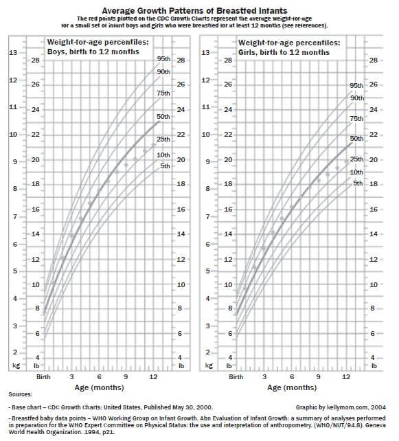
Mrs Michael, the visiting American ambassador has brought her twins, a boy and a girl who are 9 months old. She is also looking after her late sister’s daughter who is 1 year old. Use the table below.
BMI for age percentile range | Weight status |
<5th percentile | Underweight |
5th percentile to < 85th percentile | Healthy |
85th percentile to < 95th percentile | Risk of overweight |
≥ 95th percentile | Overweight |
- What is the weight of her daughter at the 75th percentile? (1)
- Give a range of percentile curves for her son who weighs 10,5 (1)
- Calculate the BMI of her niece whose height is 60 cm and whose weight at the 25th Give your answer in kg/m2.
Use the formula : BMI = mass . (3)
height2 - Do you think she must be worried about her niece’s health status? Explain. (1)
- What does it mean if the weight of a child is at the 68thpercentile? (2) [8]
Solutions
- 9 kg ✓
- 90th to 75th percentile ✓
- Her weight is 9 kg ✓
60 cm = 0,6 m
BMI = mass .
height2
= 9/0.62
= 25 kg/m2 ✓ - No, because she is healthy according to the BMI table. ✓
- The weight of 68% of the children of her age group is less than hers, and the weight of 32% of the children in her age group is above hers. ✓✓ (2) [8]
Activity 5: Working with bar graphs
The compound bar graph below shows the percentage of South African children for age seven to thirteen enrolled in primary schools during 1996 and 2007.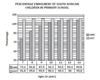
[Source: www.businessreport.co.za. 8 November 2007]
Use the graph above to answer the following questions.
- What percentage of 10 year olds was enrolled during 1996? (1)
- Calculate the increase in the percentage enrolment of 11 year olds from 1996 to 2007. (1)
- Which age group had
- the largest percentage enrolment in 1996? (1)
- the smallest percentage enrolment in 2007? (1)
- the greatest increase in percentage enrolment between 1996 and 2007? (1)
- If there were 240 000 ten year old children in South Africa in 1996, calculate the number of 10 year olds enrolled in primary schools in 1996. (2) [7]
Solutions
- 91,3% ✓
- Increase = 96,3% - 93,6% ✓
= 2,7% (1) -
- 13 year olds ✓ (1)
- 7 year olds ✓ (1)
- 7 year olds ✓ (1)
- d. 91,3% of 240 000
91,3 ÷ 100 × 240 000 ✓
= 219 120 ✓ (2) [7]
Activity 6: Working with histograms
Mr Smith, an investor from Australia, has just opened the branch of Raetsiza Company in Pretoria central. The graph below represents the salary categories of the employees versus the number of employees per category. Study the graph and answer questions that follow.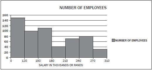
- How many people were employed by the Raetsiza Company? (2)
- How many employees are earning the lowest salary? (1)
- Why do fewer employees earn the highest salary? (1)
- Give possible reasons why there are fewer employees in the category of R180 000 to R210 000. (1)
- If the salary increases by 6%, what will be the new maximum amount for employees in the category R150 000 – R180 000? (2) [7]
Solutions
- 150 + 100 + 110 + 40 + 70+ 80 ✓ + 30 = 580 ✓ (2)
- 150 earn less than R120 000 ✓ (1)
- They are senior employees. ✓ (1)
- They have got special skills. ✓ (1)
- 106% of R180
= 1,06 × R180 000 ✓
= R190 800 ✓ (2) [7]
Activity 7: Working with pie charts
A recent survey looked at households in two income groups. The study determined what percentage of monthly income was spent on food, housing and other requirements. The pie charts below represent the findings of the study.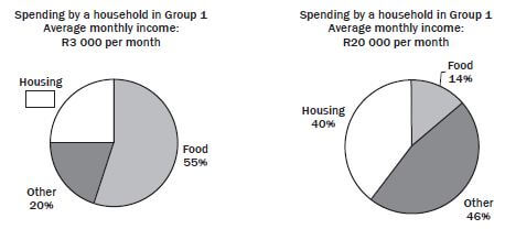
- What were the average monthly incomes of the groups considered? (2)
- What percentage of Group 1’s earnings was spent on housing? (1)
- How much was spent on housing by a household in Group 2? (2)
- Which group spent the larger amount of money on food? Justify your answer by calculations. (5) [10]
Solutions
- R3 000 and R20 000 ✓✓ (2)
- 100% – 75% = 25% (1)
- (40 ÷ 100) × 20 000
= R8 000 ✓ ✓ (2) - 1. (55 ÷ 100) × 3 000
= R1 650 ✓
2. (14 ÷ 100) × 20 000
= R2 800 (2 spent more) ✓✓ (5) [10]
Activity 8: Box and whisker plots
(Sunday times 2009 Q & A)
The box and whisker plot below represents the batting averages of 160 cricketers who have batted in T20 matches since 1 January 2009. Answer the questions that are based on the plot.
- What is the name given to the two data points with values 57 and 57,33? (1)
- How many players have a batting average less than 6,25? (2)
- What must a batsman’s average be for him to be in the top quartile? (1)
- Jacques Kallis is the South African with the highest batting average. If his average is 48,4, how does he compare with the other batsman? (1) [5]
Solution
- Outliers ✓ (1)
- About 40 players (lower quartile of 160 players) ✓✓ (2)
- >25,5 ✓ (1)
- He is definitely in the top quartile. ✓ He is close to the highest batting averages so he compares favourably with the best batsmen in the world. (1) [5]
Activity 9: Revision exercise
Misleading graphs
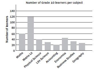
- Look at the bar graph below and answer the questions that follow

- Does this graph tell us how many Grade 10 learners there are in total? (3)
- Can we assume that none of the learners who take Accounting take Geography? (2)
- A pie graph of this data would not make Explain why. (3) [8]
Solutions to 1
- No. It may look like there are 140 learners in total ✓ but learners take more than one subject, ✓ so we can’t use the numbers of learners per subject to determine how many learners there are altogether. ✓
- No, we have no information ✓ about whether learners can take both Accounting and ✓ (2)
- Learners do not only take one subject, ✓ therefore the data cannot be split into discrete percentages ✓ per subject and represented using a pie ✓ (3) [8]
2). The two graphs below show the same data in different forms about the members of Uthando Saving Club from 2004 to 2007. Using the graphs, explain whether each of the statements beneath is true or false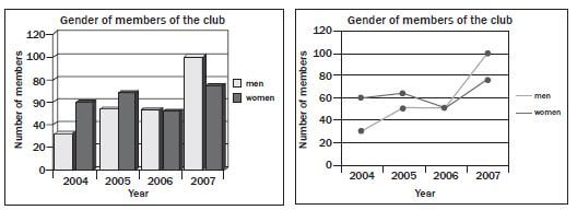
- The number of female members was greater than the number of male members each year. (1)
- In 2006 the numbers of male and female members were equal. (2)
- The number of members who are men has gradually increased over the (2)
- There were more female members in 2007 than there were in (1)
- There were more male members in 2006 than there were in (1)
- The comparison of male and female members has changed over the years. (1) [8]
Solutions to 2
- FALSE – In 2007 there were fewer female members. ✓
- TRUE – In 2006 the bars for men and women are the same height on the bar chart; ✓ on the line graph the lines showing ‘men’ and ‘women’ cross. ✓ (2)
- TRUE – In 2005 and 2006 the number is the same, but over ✓ the four-year period overall, it gradually increases✓ (2)
- TRUE – The line showing the ‘women’ is higher in 2007 than the same line in 2005✓ (1)
- FALSE – There is the same number of men in 2005 and 2006✓ (1)
- TRUE – In 2005 there were more women than men; by 2007 there are more men than women. ✓ (1) [8]
3). Marvin has a gym. In 2012 a total of 1 150 people attended the weight-lifting classes. He kept a record of the number of males, females and different races attended the weight-lifting class from 1 January to 31 December
TABLE: Number of males and females attending the weight-lifting classes
Month | Number of males | Number of females |
January | 60 | 16 |
February | 71 | 19 |
March | 63 | 18 |
April | 82 | 15 |
May | 80 | 19 |
June | 52 | 13 |
July | 96 | A |
August | 79 | 14 |
September | 80 | 15 |
October | 119 | 20 |
November | 76 | 25 |
December | 85 | 18 |
TOTAL | 943 |
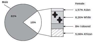
3). Use the pie chart and the table above to answer the following questions
- Give the ratio (in simplest form) of the number of females to males who attended the weight-lifting classes in September 2012. (2)
- Calculate the missing values A and B(5)
- If a weight lifter is chosen at random from the whole year’s weight-lifting class, what is the probability that the weight lifter will be a white female? (5)
- Determine the:
- mean (average) of the number of males in the weight-lifting class (2)
- modal monthly number of females in the weight-lifting class (1)
- median of the number of males in the weight-lifting class (3)
- range of the number of females in the weight-lifting class(2) [20]
Solutions to 3
- 15: 80 ✓
= 3: 16 ✓ - A =1 150 – (943+16+19+18+15+19+13+14+15+20+25+18) ✓
= 1 150 – 1135
= 15 ✓
B = 18%- ✓ (1,57%+8,26%+5,08%) ✓
= 3,09% ✓ - Number of females =1 150 – 943
= 207 ✓
Number of white females = 8,26% of 207 ✓
= 17,0982
≈ 17 ✓
P (white female) = 17 ✓
1 150
= 0,01478 ✓ - (i) Mean = 943 ÷ 12 ✓
= 78,58
≈ 79 ✓
(ii) Mode =15 ✓
(iii) 52;60;63;71;76;79;80;80;82;85;96;119
Median = 79+80 ✓
2
= 79,5
≈ 80 ✓
(iv) Range = 25 – 13 ✓
= 12 ✓
